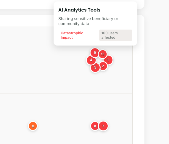
Reading the Heat Map
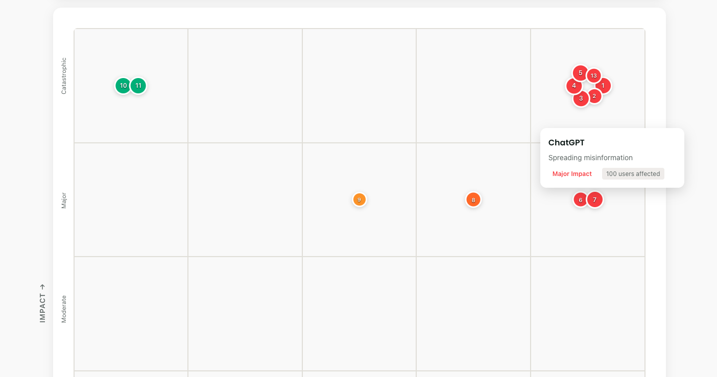
The grid is simple:
- Bottom to top: How bad would it be? (Impact)
- Left to right: How likely is it? (Likelihood)
- Dot size: How many people affected
- Colors: Green (manageable) → Red (critical)
Each risk gets a number. Risk #3 might be "Beneficiary data in ChatGPT." Risk #7 could be "Biased community needs assessment." Numbers create accountability.
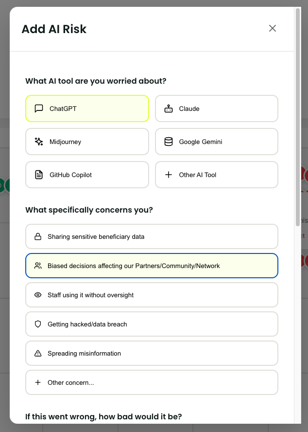
Adding Your First Risk
- Click "Add Risk"
- Pick your AI tool (or add custom)
- Select your concern
- Slide impact: "If this happened, how bad?"
- Slide likelihood: "Given our current controls, how probable?"
- Estimate affected users
- Click "Add Risk"
Done. Your first risk appears on the grid. The visual impact is immediate.
Understanding Risk Patterns
Patterns emerge fast:
- Red cluster? Crisis mode needed
- Yellow spread? Systematic improvements required
- Green concentration? Good controls, stay vigilant
- Empty top-right? You're managing well